Recap
Earlier in this mod, we first learned how to create layouts with horizontal and vertical stacks and the Rectangle shape:
Recall that shapes are push-out, or “greedy”, views.
They take up as much space as they can.
As well, the specific amount of space that a shape has available to draw itself within will vary.
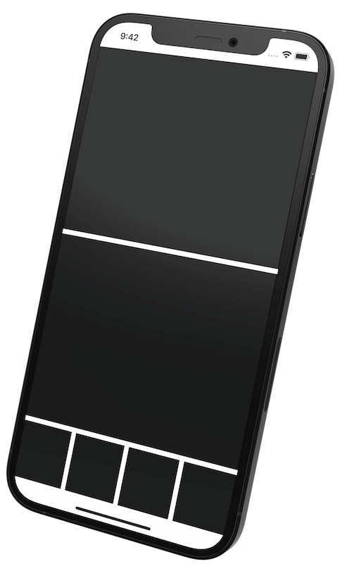
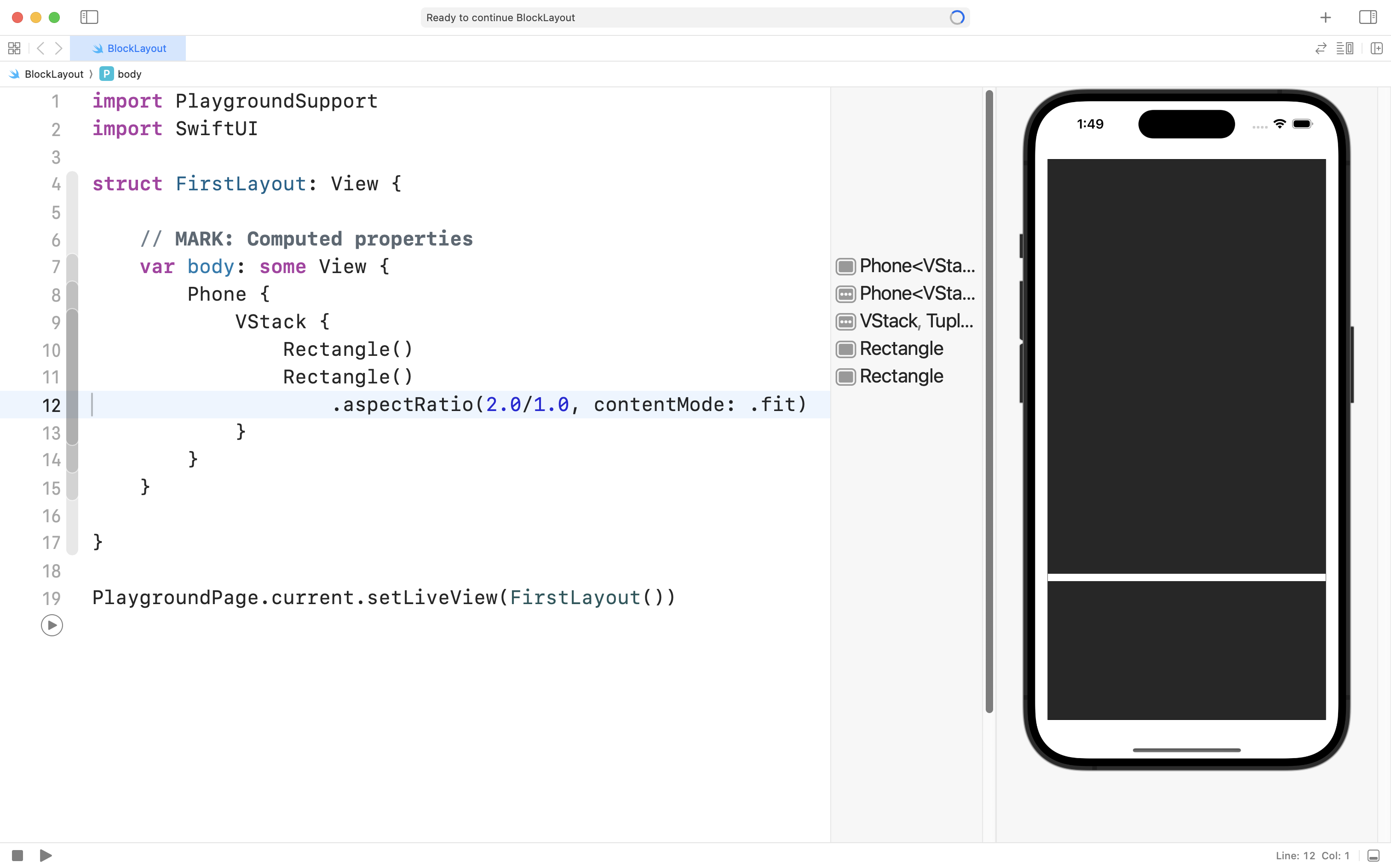
For example, here, from Block Layouts, Part 2, we used the .aspectRatio view modifier to make the second rectangle be twice as wide as it is tall:
Built-in Shapes
The SwiftUI framework, in fact, provides us with six built-in shapes that look like this:
_10.9_2024-11-24_16.49.48.png)
The code that produces the output above looks like this:
struct BuiltInShapesView: View {
    var body: some View {
        VStack {
            Rectangle()
                .fill(.gray)

            RoundedRectangle(cornerRadius: 25)
                .fill(.red)

            UnevenRoundedRectangle(cornerRadii: .init(topLeading: 50, topTrailing: 50))
                .fill(.orange)

            Capsule()
                .fill(.green)

            Ellipse()
                .fill(.blue)

            Circle()
                .fill(.yellow)
        }
        .padding()
    }
}

#Preview {
    BuiltInShapesView()
}
Of course, we could place some text inside another VStack and then embed both VStack structures inside of an HStack:
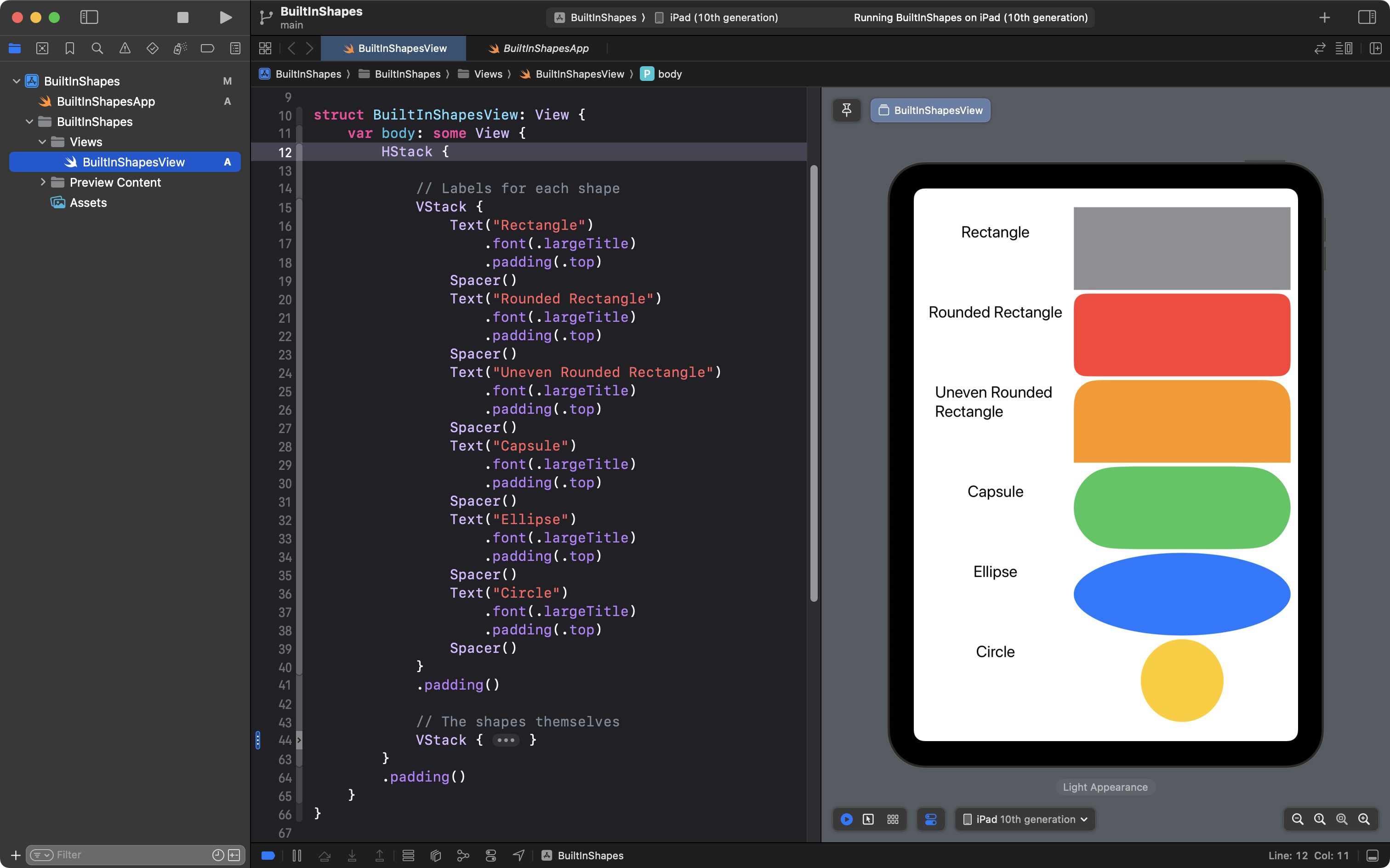
Now, although the shapes in the second VStack remain “greedy”, they cannot take up as much space as before. The code that draws the shapes is the same, but the shapes themselves are a different size on screen.
This is an important concept to understand when designing custom shapes, which is what we are going to learn about next.
Custom Shapes
“[A] shape has no idea where it will be used or how big it will be used, but instead will be asked to draw itself inside a given rectangle.”
SwiftUI implements
Shapeas a protocol with a single required method: given the following rectangle, what path do you want to draw?
A custom shape is defined in SwiftUI as… wait for it… a structure!
To define a custom shape, the structure must conform to the Shape protocol.
The Shape protocol requires that the structure have a method (also called a function) named path.
TIP
A method or function is very much like a computed property – it runs some logic for us and returns a value.
A method or function is different from a computed property in the following way – a method or function can take one or more pieces of input to do it’s job.
The
pathfunction in a structure that conforms to theShapeprotocol accepts one piece of input – the rectangle within which the shape must draw itself.
It is our job to define the outer edges of the shape in question – the path – that will define the form that will be drawn within the provided rectangle.
Drawing a triangle
So… what does this actually look like, in practice?
Here is a plan for drawing a triangle by defining a path using the Shape protocol:
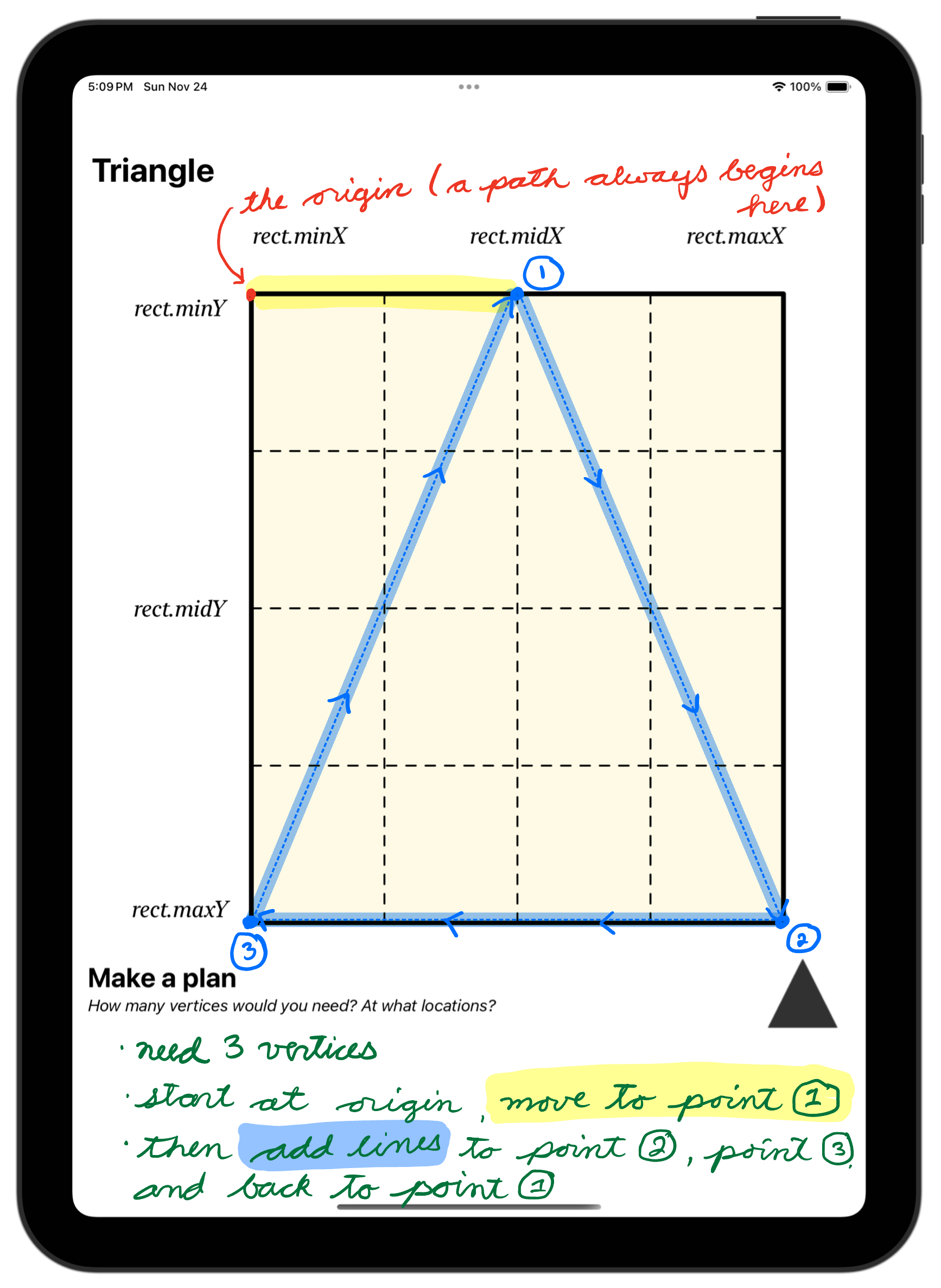
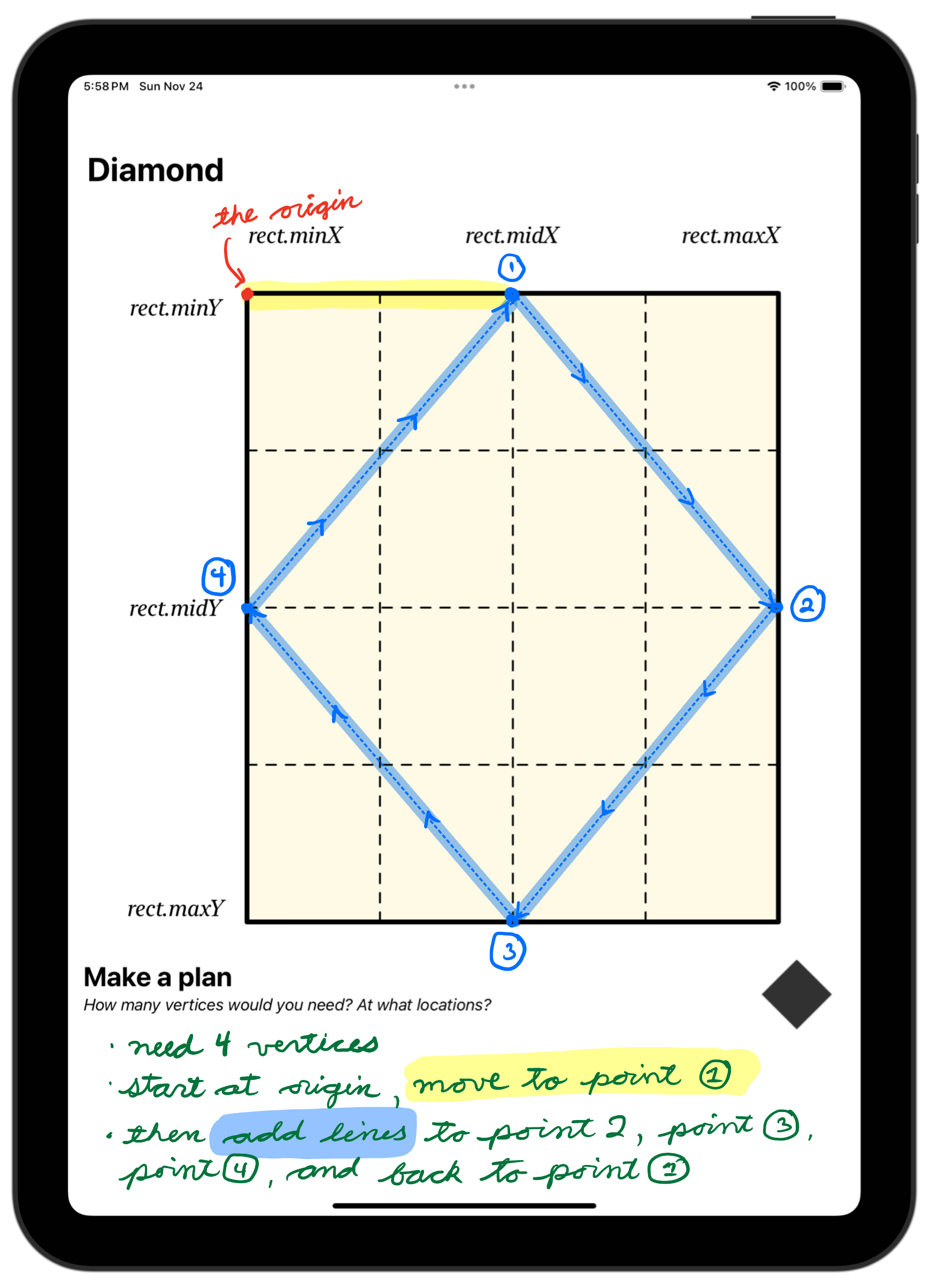
The origin is located at and exists in the top left corner.
In this plan, we first move the path to the middle of the -axis, and the bottom, or minimum, of the -axis.
The rest of the plan indicates that the triangle will be defined by three lines. The first line is drawn from point 1 to point 2. The second is drawn from point 2 to point 3. The third line is drawn from point 3 back up to point 1.
Here is what this looks like, in code:
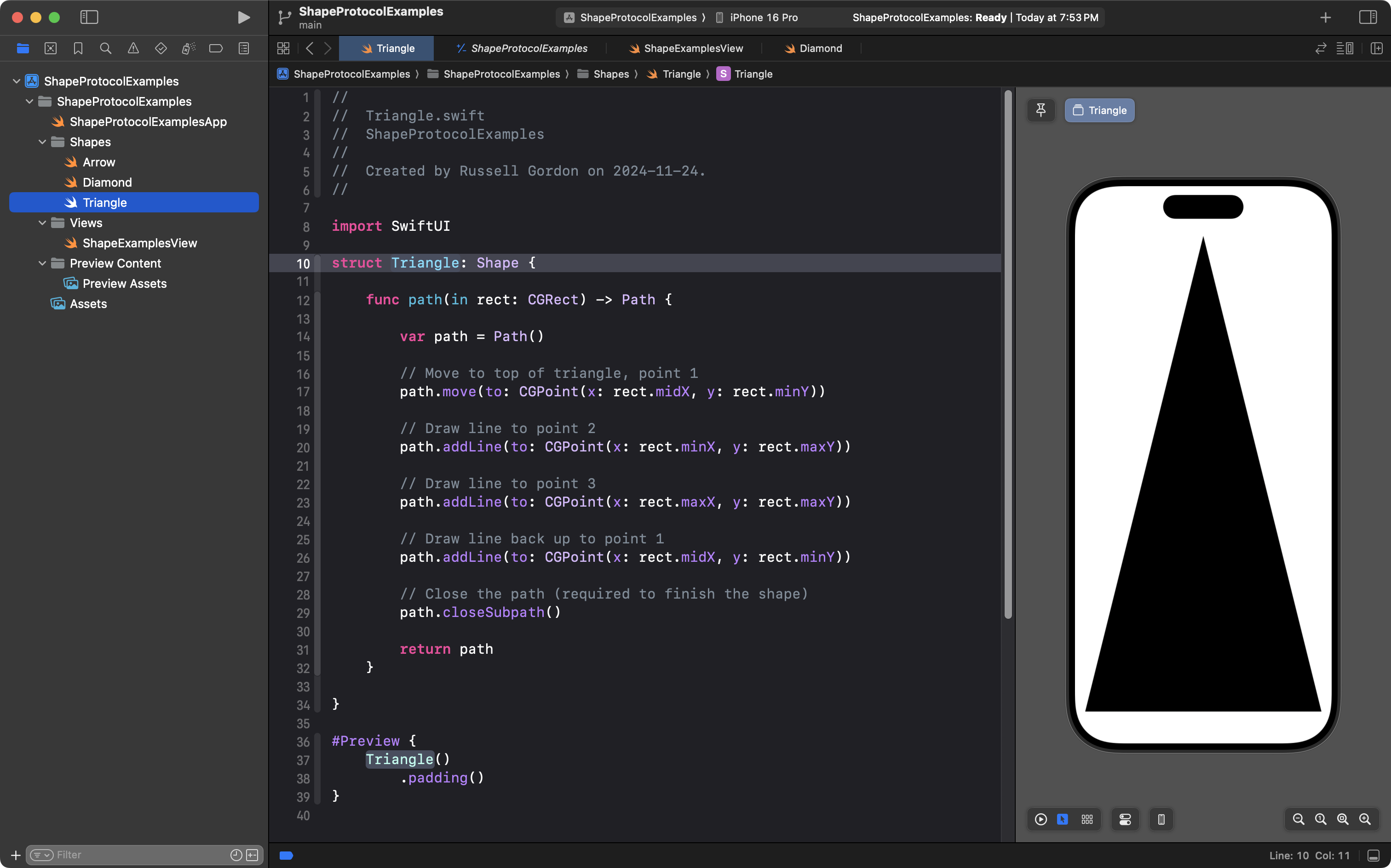
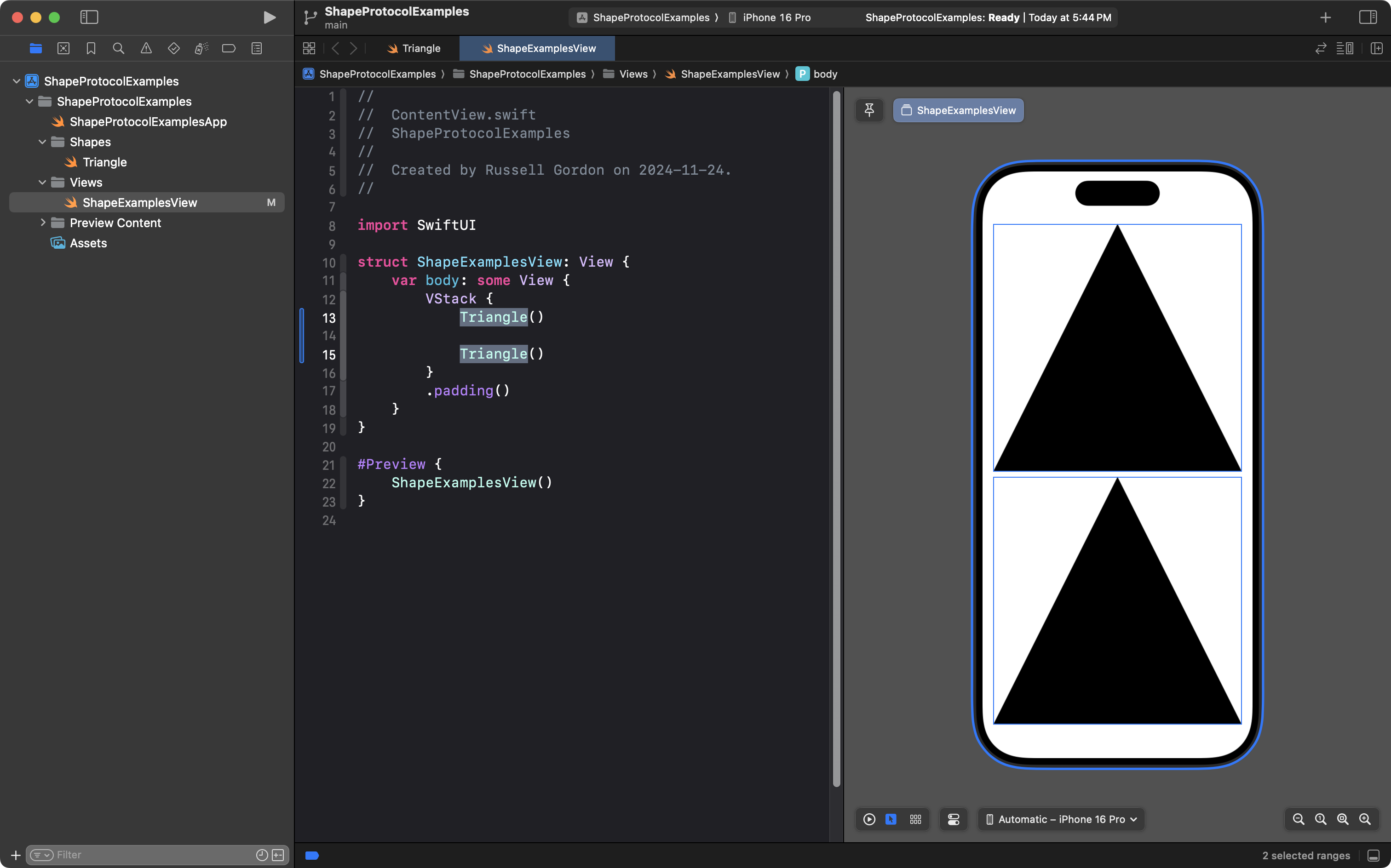
If we then use this newly-defined custom shape, the Triangle structure, inside of a VStack, we will see that the VStack evenly divides the available space between it’s children:
TIP
Note the fine blue box around each triangle. This is the rect or rectangle that the SwiftUI framework allows the shape to be drawn within.
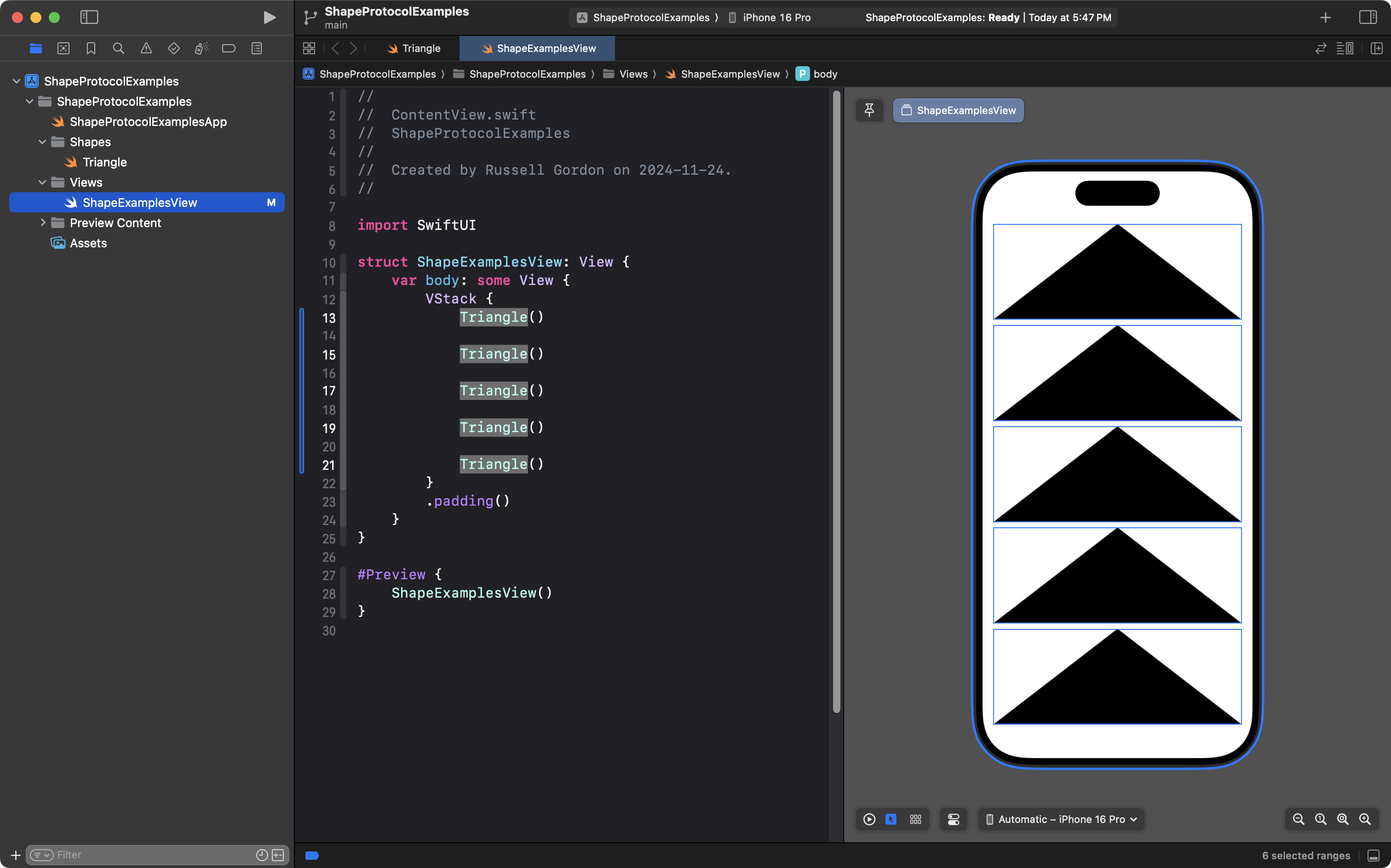
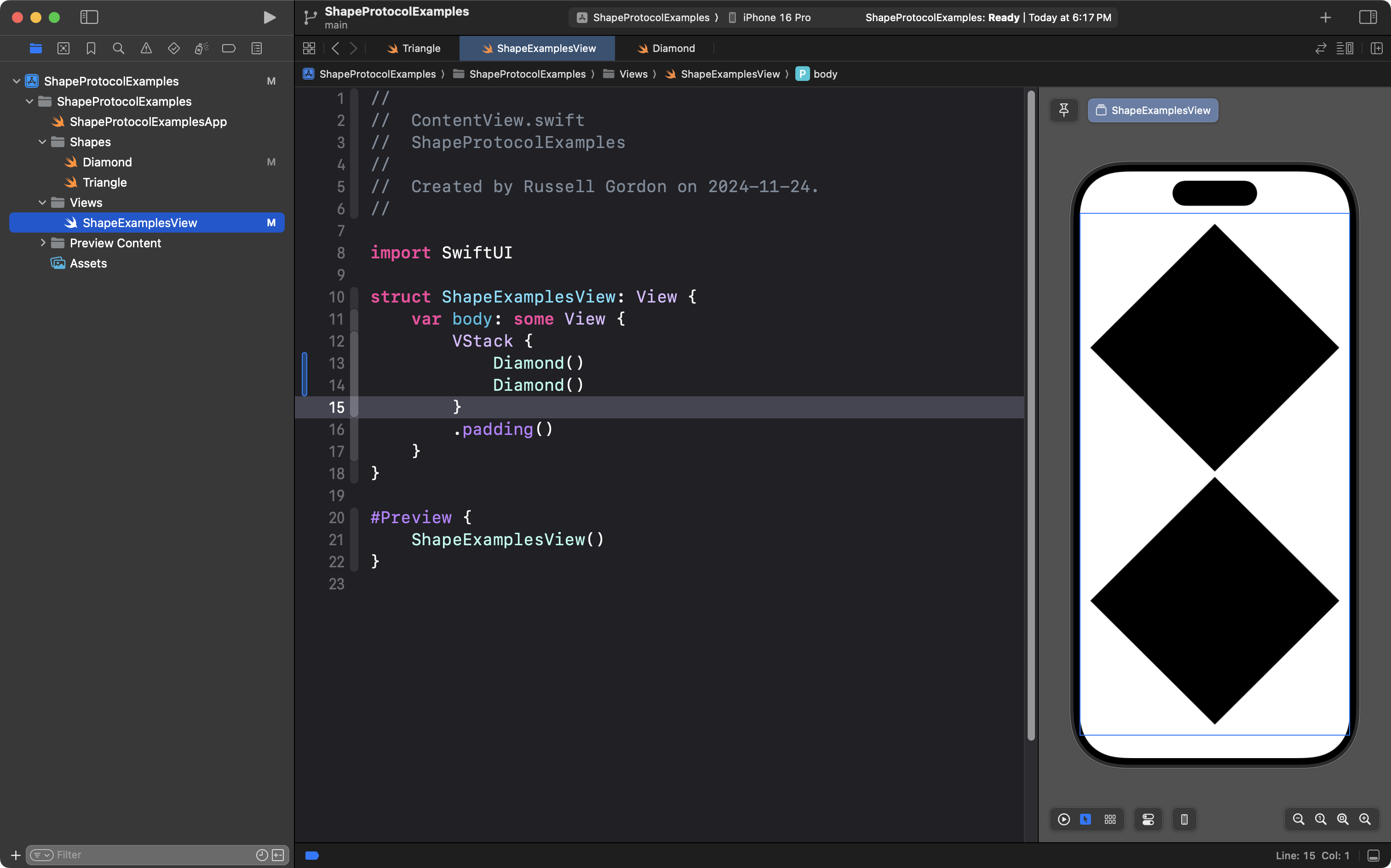
If we add more triangles to the VStack, the rectangle each triangle will be drawn within is correspondingly smaller, which changes the appearance of each triangle, compared to the prior example:
Drawing a diamond
Here is a plan for drawing a diamond by defining a path using the Shape protocol:
Here is a 3-minute video showing exactly how to write the code for this, from scratch, within an Xcode project – making good use of the autocomplete feature:
Here is what the finished code looks like:
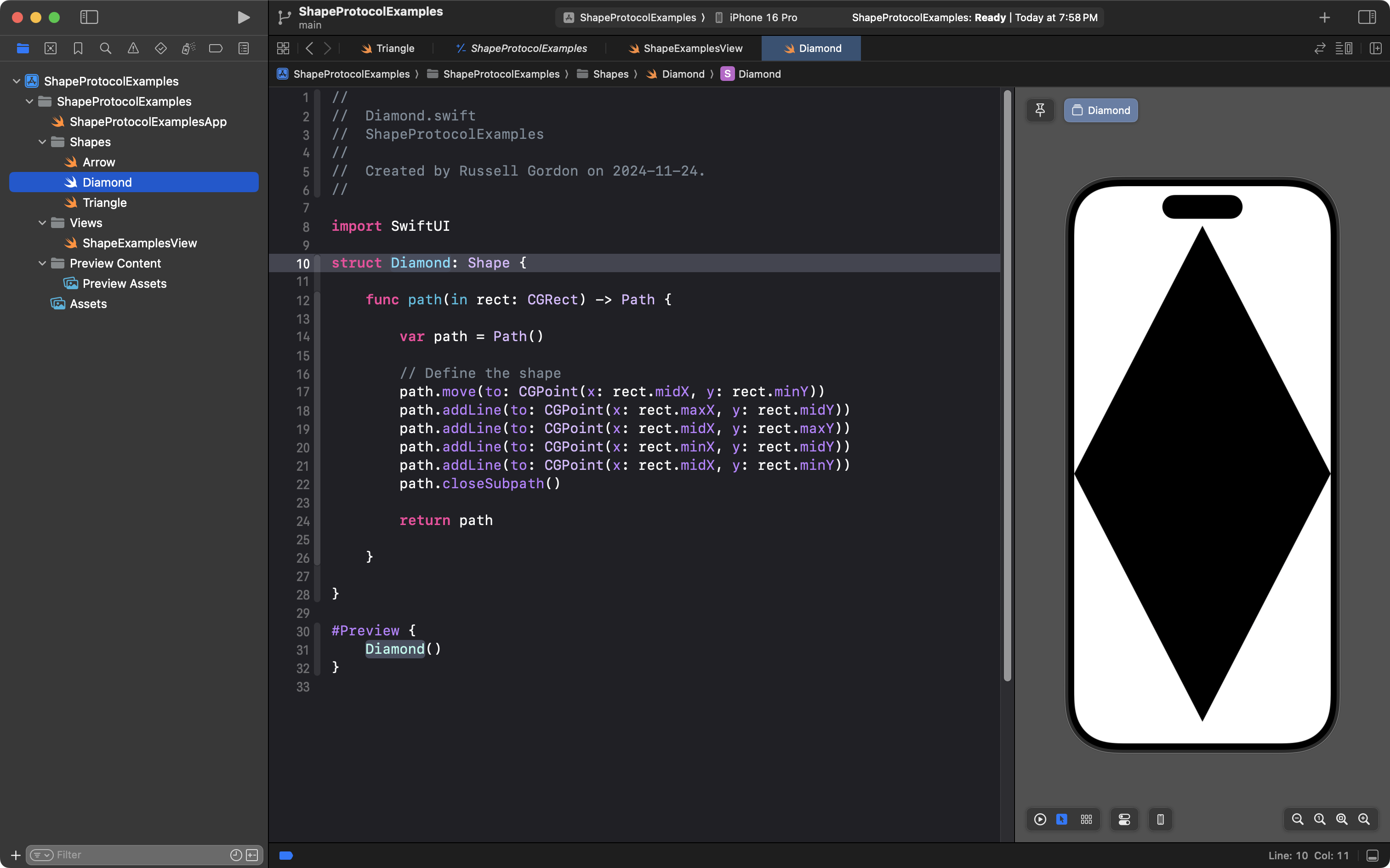
… and an example of using it in a view:
Fills and borders
Paul Hudson has authored a nice summary of how to fill and stroke (draw a border) on shapes using SwiftUI.
You can create some pretty fun effects:
The core idea is that you can set both a fill and a border (also called a stroke) for any given shape.
A shape can only have a single fill, but it can have multiple borders (strokes).
For example:
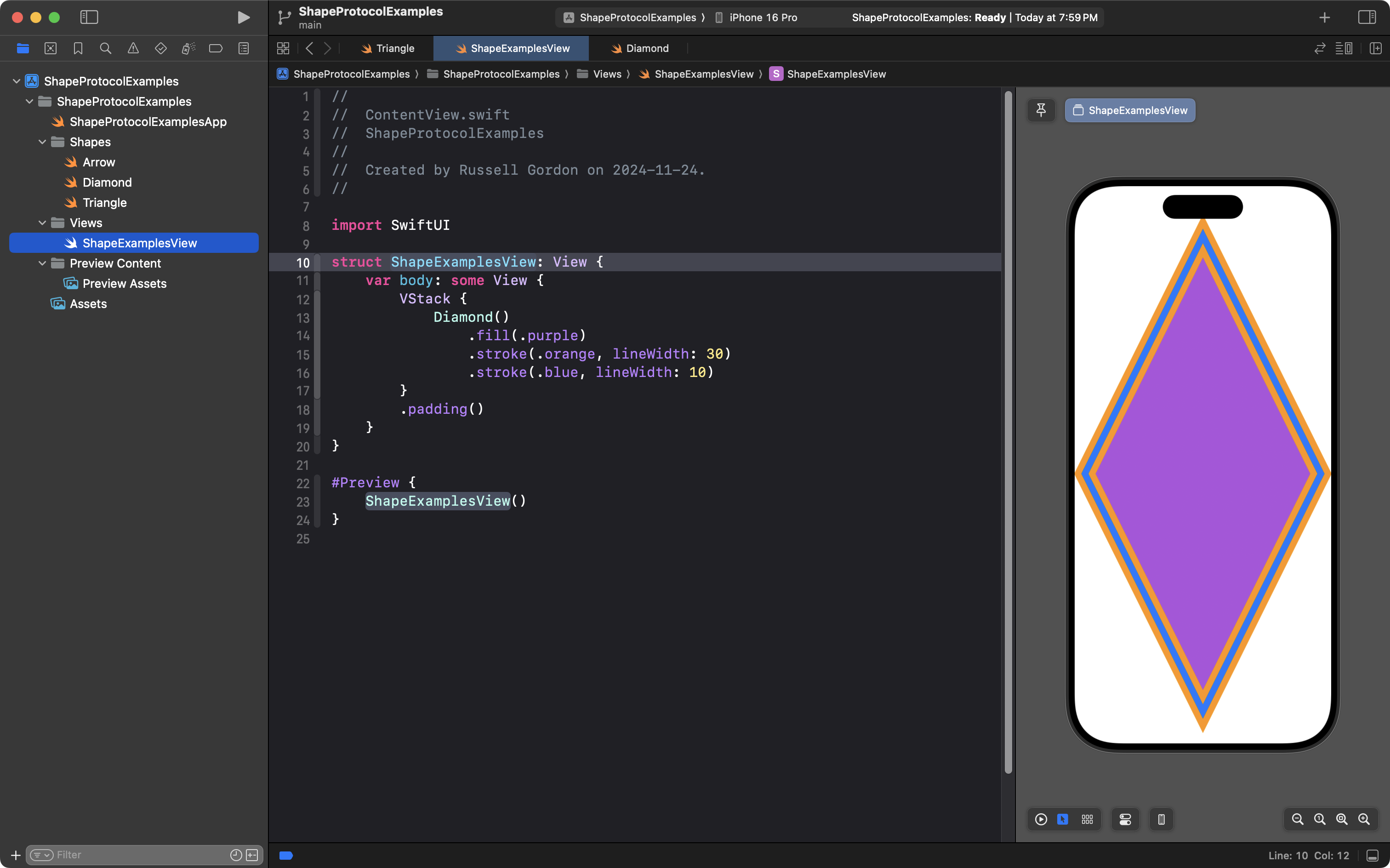
Notice how the blue border overlaps the orange border. That is because the .stroke view modifier (in blue) comes after the earlier .stroke view modifier in orange. Each stroke, or border, overlaps the other.
Exercises
TIP
Be sure to share evidence of your plans made on paper in your portfolio post for today’s class. You have permission to take your phone out during today’s class to take photographs of your plans.
1. Right Triangle
Use one of the hard-copy planning sheets available in class, print the image below (if you are outside of class time right now), or copy the image to an iPad – then make a plan to draw a right triangle, along the lines of what you saw in the examples above:
_10.9_2024-11-24_19.55.27.png)
Then, write code in an Xcode project to define and then use a custom right-triangle shape. Try setting a fill or stroke on the right-triangle after you define the shape.
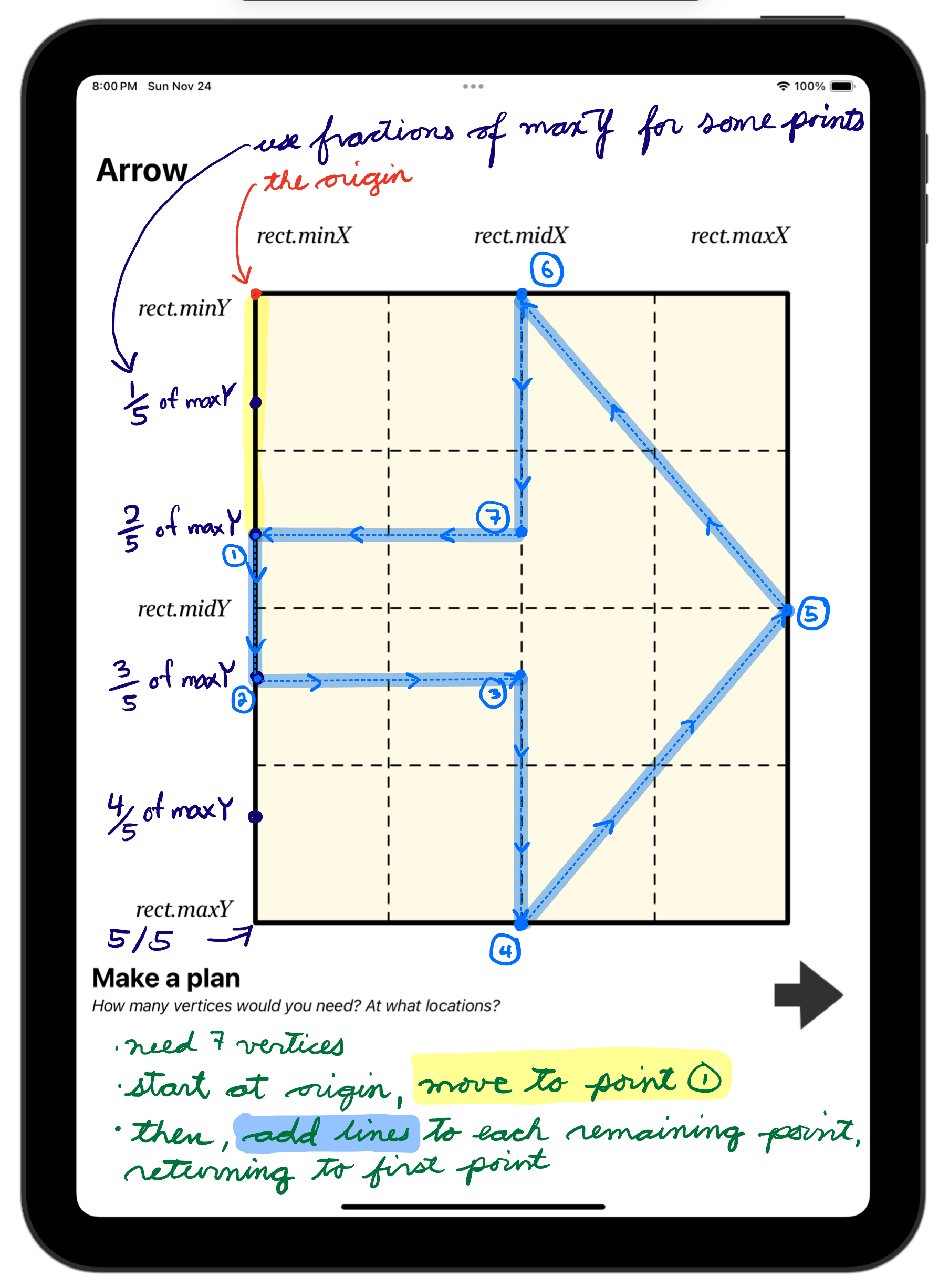
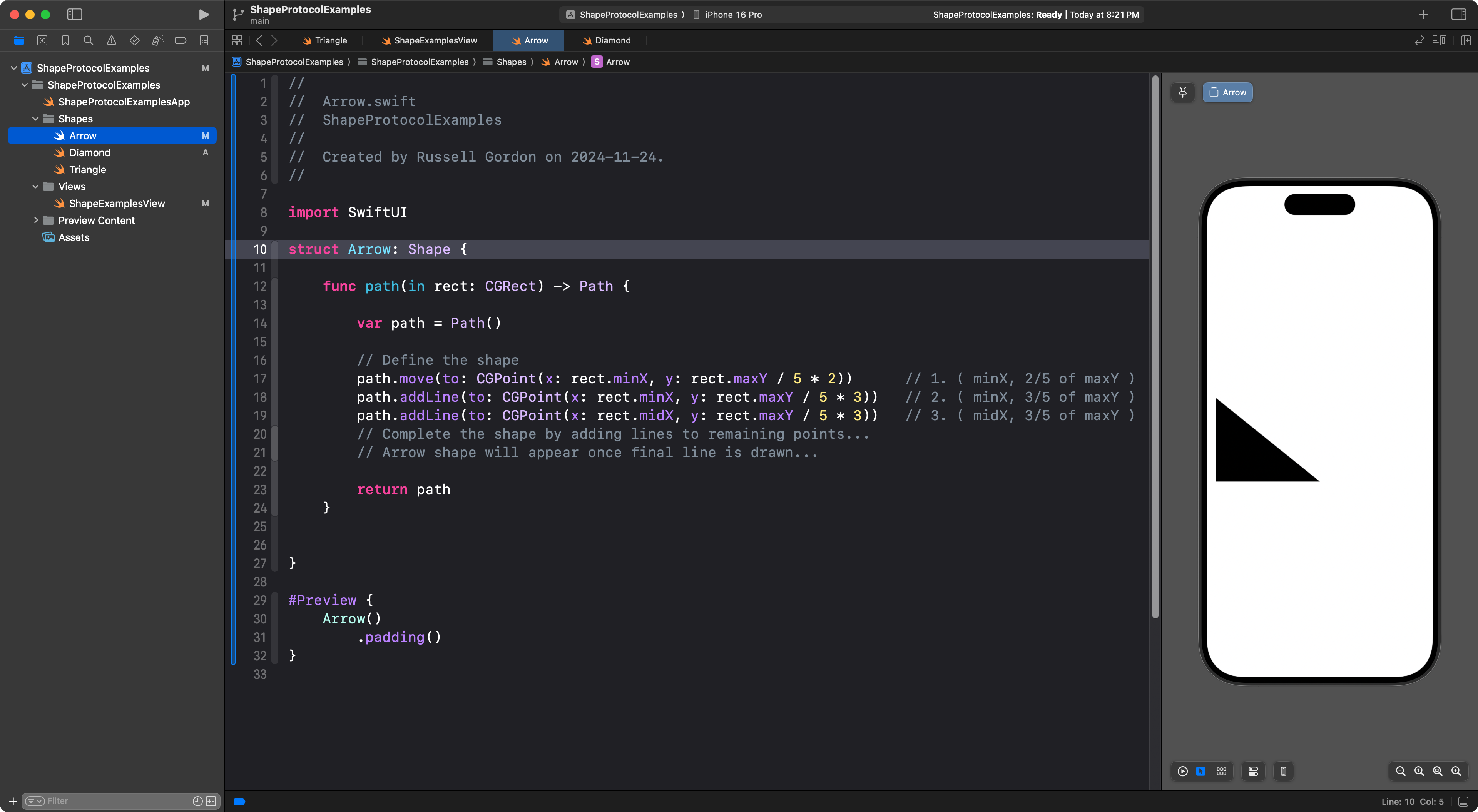
2. Arrow
It is possible to use fractions of a dimension to define the vertices of a shape.
Consider this plan for drawing a right-facing arrow:
Here is the start of the code to implement this plan:
If you prefer, you can work using the decimal equivalents of fractions:
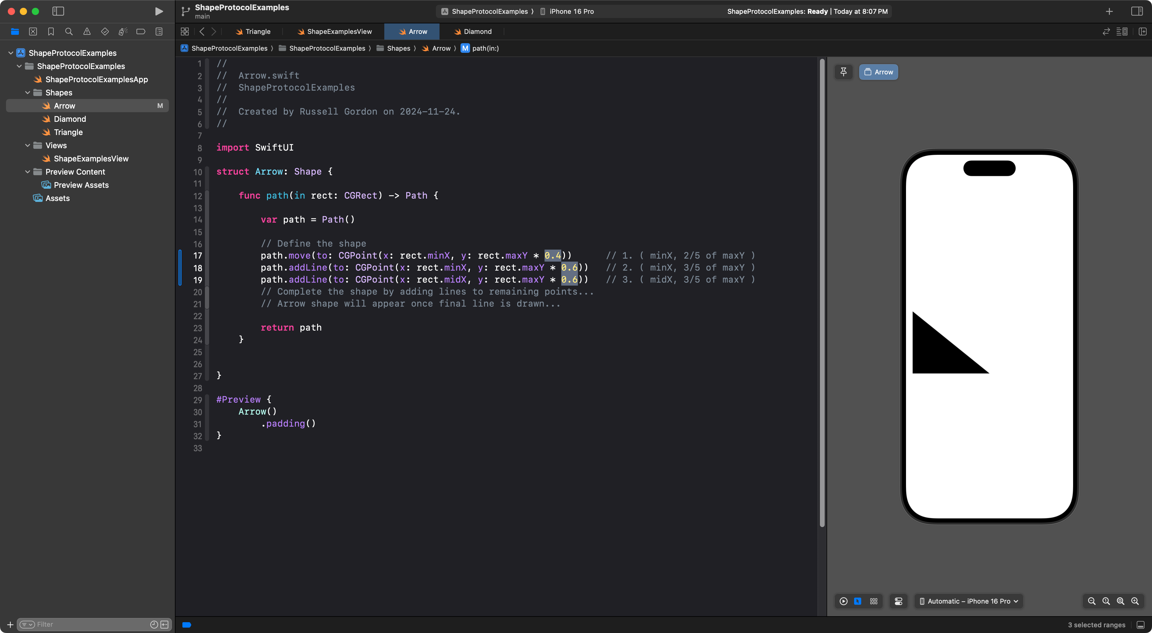
Finish defining the arrow shape.
3. Challenge
For a challenge, complete any one of the following three custom shapes – making a plan on paper before writing code:
_10.9_2024-11-24_20.28.21.png)
_10.9_2024-11-24_20.29.12.png)
_10.9_2024-11-24_20.29.46.png)